Super Diner Designs
Continuing with Behance design challenges, I’ve started a series related to food. First I designed a logo for a diner I call, “Super Diner.” And this week, using that logo as a starting point created a drink coaster for the super diner. I’m fairly familiar with Adobe Illustrator, but each design challenge I do, I find something new.
With the logo challenge, I started with some base words to work off of. These words help guide the direction and feel of the design. The challenge referred to these words as the corporate core.
Traditional
Vintage
Bold
Colorful
Friendly
From there I looked at some reference images of diners, and traditional diner signage. These images helped me get an understanding of what diner graphics looked like. They also helped me hone in on a color palette for the final design. But before diving into color, I started with fonts.
I tried writing out super diner in a variety of different typefaces that looked like something you would see on a diner menu. A playful script, Bounce Script Regular, and thick sans serif font, Meatball, that looks almost like a sharpie marker, are what I landed on.
From there I experimented with a variety of placement and shape combinations. I learned how to add segments to a circle shape to create a star. Using offset path, I created a nice outline for the script font to help it stand out next to the thicker sans serif font. And lastly to tie it all together I created a distorted rectangle to make the logo look like a roadside sign. Another reason I didn’t start with color was to make sure the logo was legible in black and white.
Now looking back at the reference images, I found a baby blue, light red and a sea foam green that really stood out to me. Using the base black and white logo, I began changing colors to see how well I could maintain visibility. The red I chose felt too aggressive to be friendly, so I lightened it to a pink. I added a color field and a few highlights to unify the design.
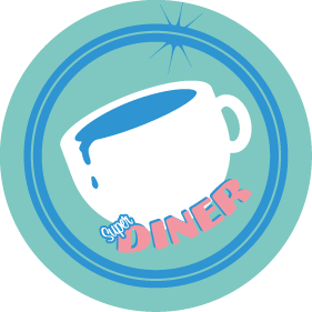
With the logo finished, the second challenge I jumped into was to create a drink coaster. I wanted to keep the same motif while exploring some new ideas. The coaster template I chose was a 3.9 X 3.9 inch circle. I transformed the logo from a rectangular shape into a circular shape by arching the text with envelope warp. I got rid of the rectangle and mimicked the design with a circle. Learning about the shape builder tool, I created a coffee cup spilling coffee to represent the need for the coaster. The shape builder tool allows you to combine and delete overlapping shapes with ease. It made the design process even faster.
I’m continuing to have fun learning more about various tools and techniques I didn’t know existed. I look forward to seeing how far I can build out this Super Diner brand.