Twinkle
Client name: Twinkle
Role: UI Designer
Overview: Back end design for After school management programs.
Deliverables: Style Tiles, Hi Fidelity Screens, Prototypes
Tools: Sketch, InVision, After Effects, Google Docs, Pen and Paper
Project Length: 5 Weeks
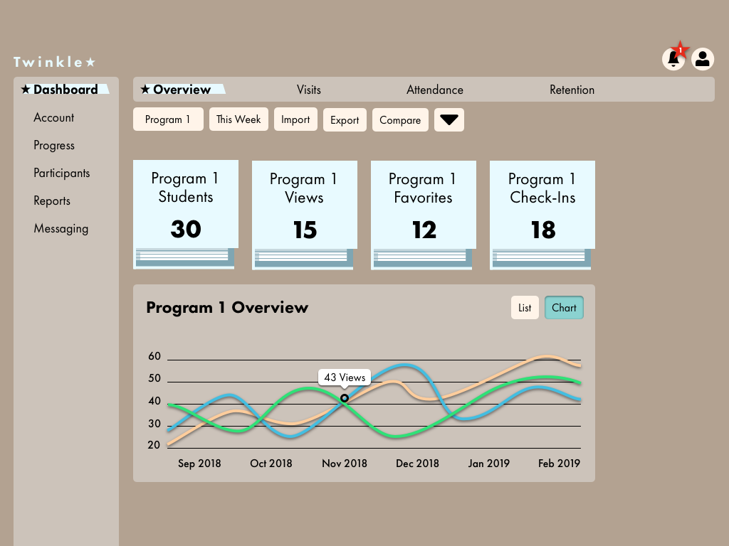
The Problem:
Agencies need a tool to aid in recruitment, retention and engagement of their programs because they want to maximize their time to enhance their agency specific mission.
Design Principles:
We began by brainstorming different principles individually. Then coming together, we found overlap and honed in on the top three themes.
Iterative: Responding to user behavior to create updates based on evidence. What people do (not what they say they do).
Part of Modular Design: Understanding the context of this service, and how it is used with others in the program ecosystem. Having editable pieces without affecting the whole.
Universal: Accessible to a wide range of people. Considering the community that the project is for and creating welcoming visuals that cater to them.
paper craft, DIY, inquisitive

Mood Board
This board is relevant to an after school program app because it relates to the customizable options of a flexible app. It promotes out of the box thinking for event planning. It also promotes creativity between children and adults.

Style Tile
This style tile is based on the ideas of paper craft, DIY, and inquisitive. The reason for this is to make the app feel kid friendly, playful and fun to use, as well as making looking at data exciting. The paper shapes with shadows give the design depth and texture that makes it feel less virtual and more tactile. The brighter colors give the design a positive and fun feeling. The font is Interstate, which is designed to be legible from far distances. This lends itself to young as well as older teachers that may have a harder time looking at screens.
soft, comforting, a favorite blanket

Mood Board
This board is relevant to an after school program app because the colors are calming when you need to work with children and parents. The images evoke a certain cuteness which will make looking at data more fun. Blankets provide security so that the app feels trustworthy.

Style Tile
This style tile is based on the ideas of soft, comforting, and a favorite blanket. The reason for this is to make the app feel trustworthy, as well as make the user feel unintimidated having to deal with a lot of data. The main shapes used all have curves that represent a soft feeling. Lighter colors were chosen to give a calming feeling. The font is Avant Garde Gothic Pro which gives it a delicate yet sophisticated look. This lends itself to a softer view of information while still retaining a sense of importance.
storybooks, illustrative, adventurous

Mood Board
This board is relevant to an after school program app, because it is a common crossroads between children interacting with adults. It promotes learning and reading as well as exploring new ideas.

Style Tile
This style tile is based on the ideas of storybooks, illustrative, and adventurous. The reason for this is to make the app feel like a bridge between children and adults, as adults often read illustrated books to children. The design accents were used to make the Administrators feel like they are interacting with classic literature, while the whimsical illustrations help give the data a sense of wonder and exploration. The colors are muted to allow the user to look at data for longer periods of time. The font is Futura which gives a sense of discipline and balance to the illustrative look.